Asking me to choose between pastels and bright colours is like asking me to choose a favourite food.
I love them all but it often comes down to how I’m feeling.
I’m fickle like that. Can you relate?
Some days, I’m feeling confident and energised and am looking for a colour to reflect my mood. It might be a bold cobalt blue, a bright red, a vibrant hot pink or a generous pop of yellow.
Often at the same time …
Other days, I prefer the muted tones of mint, blush pink or a soothing aqua, especially if I’m feeling low key, subdued or feel like channelling some old school vintage.
I’d hazard a guess though that most people prefer one over the other.
When a new season of fashion drops, it’s often the case that it’s brights OR pastels.
This Autumn though, there’s a bit of everything, if you know where to look. While the classic autumnal tones of rusty red, burnt orange, mustard and saffron yellows are more than accounted for, there’s also a smattering of pastels here and there.
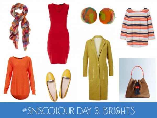
TOP ROW, L-R: Retro Rainbow Scarf, $29.95 from Sportsgirl; Isabella dress, $199 from Saba;Earrings, $26 from Ruby Olive; Multi Stripe T-Shirt, $59.95 from Country Road.
BOTTOM ROW, L-R: Essential Pullover, $69.95 from Sportsgirl; Smoking Gun Slipper, $149 from Mimco; Chartreuse Coat, $249.95 from Seed Heritage; Abbey Bag from Boden, $238 (but reduced this week) from Boden.
As you can see above, the first wave of brights for AW16 are oranges, reds and yellows.
I’m loving orange for everyday casual, especially paired with denim or white. If stripes are involved, I’m there.
It’s hard to go past a red dress to break up a corporate wardrobe or for a special occasion.
I’m also a big fan of chartreuse worked back with classic monochrome. It also looks great paired with grey, navy or denim.
As Winter approaches, I’m hoping to see some gorgeous greens in the mix too. Fingers crossed!
If you prefer a more muted approach though, you are not alone.
In fact, you are bang on trend.
Pantone’s two colours of the year are definitely pastels (rose quartz and serenity) which will trickle through to fashion and home wares this year.

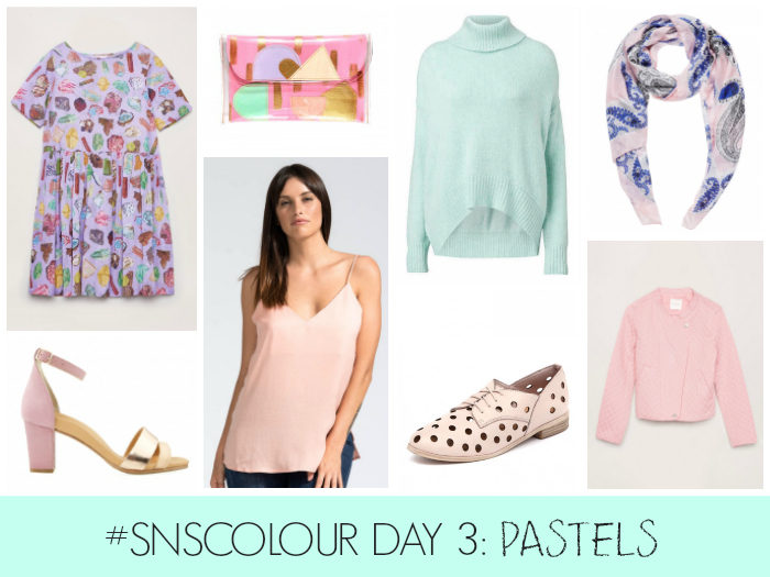
TOP ROW, L-R: Crystal Cluster dress, $199 from Gorman; Hummingbird Mini Clutch, $100 from Tiff Manuell; Hi Low Slouch Knit, $149.95 from Witchery; Paisley Silk Scarf, $69.95 from Sussan.
BOTTOM ROW, L-R: Diver Heels, $249 from Bared Footwear; Silky Singlet Top in Blush, $79.95 from Bohemian Traders; Quartet in Pale Pink, $159.95 from Style Tread; Magma Jacket, $299 from Gorman.
I love pastel and blush pinks, particularly paired with charcoals and blacks in Winter time. In the meantime, they look fresh paired with white jeans, chambray and metallics. In fact, gold and pastel pink have been one of my favourite Summer combos.
I don’t wear a lot of mauve but I do love it in small doses. This new Gorman print is a bit of fun and I much prefer it in the mauve as opposed to the black colour way.
As for aqua and mint, I’ll wear them any day of the week, all year round. To me, they are fresh, flattering and remind me of the beach, childhood and ice creams. I might need this Witchery knit for those inevitable grey Melbourne Winter days!
This post contains affiliate links. You don’t pay any extra and I earn a small commission. Read more in my Disclosure Policy here.
If you had to choose would you be on Team Brights or Team Pastels?